Following on from the well-received blog that showcased 5 of our beautiful accessible website examples from 2020, we wanted to show you an updated list of some of the Best Accessible Website Examples to use as design inspiration going into 2021. These are examples of sites we have had the pleasure of auditing or building, or that we just admire for their engaging, beautiful and accessible designs.
For those that are new to the concept, website accessibility focuses on ensuring users of all abilities can visit and use websites on any device. Website accessibility continues to grow in importance in Australia and around the globe. Here in Australia, all Government digital platforms have to meet accessibility requirements that are outlined in the Australian Digital Transformation Agency’s Digital Services Standards. Further abroad, the United States now regulates websites with the Americans with Disabilities Act (ADA), and businesses who ignore the requirement of an accessible website can actually be fined.
Even though it seems that web accessibility is being talked about more than ever, 98.1% of homepages still have evident web accessibility compliance issues according to the WebAIM Million Report.
Creating an accessible website requires designing and building many features in a slightly different way and sometimes web design teams sacrifice the overall look of the website because of this. With a growing understanding of accessibility concepts, including the Web Content Accessibility Guidelines (WCAG), partnered with overall improvements in UX and Accessibility design methods, there is absolutely no reason why an accessible website can’t be a beautiful one.
We hope these help you gain the inspiration you need to spread the word and start improving the accessibility of your websites.
Study Melbourne: Student Life
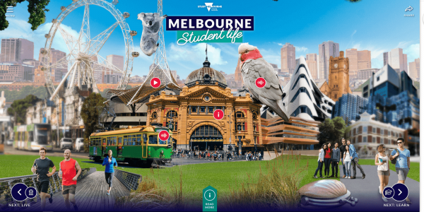
Now we thought we’d start with a favourite of ours – The Study Melbourne: Melbourne Student Life portal was launched in early 2020 and showcases some amazing interactive user experiences designed by our good friends at Versa Agency in Melbourne. Internetrix was actually lucky to partner with them on the project to audit and optimise the website accessibility to meet the WCAG 2.1 Level AA standards.
The website delivers an amazing interactive design that engages users and gives a real virtual experience of what life is like in Melbourne. The platform’s optional dynamic scroll effects let you move around and experience the sights and sounds of the city, and what’s best is it’s completely accessible.
Every dynamic image, video and sound offers accessible alternate text and screen reader compatibility options while the site can also be navigated simply by just using a keyboard or mouse.
It’s definitely one of the most exciting and engaging accessible website examples that we’ve seen released by a Government body in Australia. A big kudos to the Versa and Study Melbourne teams. We feel honoured to support this amazing platform with our professional accessibility audits and reports.
My Emergency Doctor
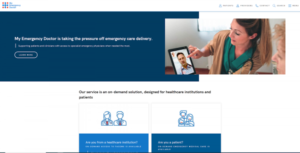
My Emergency Doctor is an innovative Australian telehealth service that provides on-demand access to specialist emergency doctors at any time from anywhere. My Emergency Doctor has recently launched their new website which offers a fresh user experience for both B2B clients (healthcare institutions, ambulance services, aged care facilities, Primary Health Networks) and B2C users (patients).
When launching the new website, accessibility was a key focus for the My Emergency Doctor team as they work closely with public bodies and serve disadvantaged user groups through their telemedicine services. When building the site, Internetrix took careful consideration of the Web Content Accessibility Guidelines (WCAG). We may be biased, but we think this is definitely one of the best accessible websites we’ve seen this year.
XPON.AI
Last but not least, our website is a great accessible website example that may provide inspiration for your next web project. Our team underwent a full rebrand which included the creation of this new accessible website.
We wanted to strip back the design and make the site easier to navigate, and as a professional digital accessibility company, we wanted to set the standard for our customers.
Our rebrand involved selecting a fresh and accessible colour palette, fonts, and set of imagery. We also built custom modules for our website through the Silverstripe CMS to ensure content managers maintained the website’s accessibility over the long-term. This included mandatory alternative text boxes for any new links or images.
How does your website compare?
We hope you have found some inspiration from the above accessible website examples and we commend you if you are looking to put web accessibility at the forefront of your digital strategy in 2021.
If you are looking to improve an existing site, we would definitely suggest starting with a detailed audit and report to identify where your site needs improvement.
If you are building from scratch and want advice, get in touch. If you’re just looking to learn more about web accessibility, head over to the Ultimate Guide to Web Accessibility. We love web accessibility and want to continue to make the web more inclusive for everyone.
*Note: The websites mentioned in this blog were designed to accessibility standards at the time of publishing. Accessibility is an ongoing investment and requires frequent auditing and content management. As the websites discussed in this blog are client-managed, we can not guarantee that they are still accessible at your time of reading. If you would like to hear about our recent accessibility projects or the ways you can meet and maintain accessibility standards, get in touch today.


