*Update: This blog is so last year! Check out our more updated version of accessible website examples for design inspiration in 2021 here.
To put it simply, website accessibility is about making sure everyone can use your website, including people with disabilities like vision impairment and mobility limitations. The web plays such a key role in many aspects of life, and with 1 in 5 Australians living with a disability, can you afford to have a website not everyone can use? Having an accessible website is a no-brainer!
So, how do you determine if your website is classed as accessible?
Some people may think website accessibility is just another buzzword, but the World Wide Web Consortium (W3C) actively maintains a checklist, known as the Web Content Accessibility Guidelines (WCAG). If your website ticks all the boxes, your website should be accessible to more users.
It is important to also include real world testing as part of your website accessibility testing process and ensure your content is easy to understand. For more information on these you can get in touch with our web accessibility experts.
The myth that Accessible Websites are visually boring and ugly
Sure, there are some pretty boring and ugly accessible websites out there, but there are also a lot of boring and ugly inaccessible websites. Accessibility is not about having an attractive user interface or having all the bells and whistles. Yes, there are some colour contrast restrictions, but with most modern websites you can achieve a beautiful, interactive and engaging website that is also accessible.
The myth comes from older web technology where popular methods of delivering interactive websites, like flash, were not accessible, so designers were limited to simpler, mostly text based layouts. This is no longer the case. You can have images, video, javascript and use a broader range of colours. Just include video transcripts or alternative text, build javascript elements so they are keyboard and screen reader accessible and make sure the colours pass contrast tests. Below we have provided a number of accessible website examples to show you exactly what is possible!
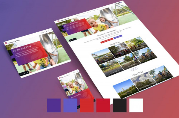
Accessible Website Example 1 – Parramatta Park
The beautiful, invigorating 85-hectare parkland of Parra Park is Parramatta’s favourite gathering place. Internetrix have worked with Parramatta Park for several years on their website development. In early 2017, we engaged on a project to revamp the existing website, giving it more vibrance and life, showing off the beauty of the park and striving to encourage more visitors and enterprise level clients to use the park and its facilities.
Using striking, big bold colours and professional photos from the park, the website is a visual feast. However, the site also caters for our users with vision impairment through the colours we chose, link styling, size of elements, code structure, alt tags on images of importance and background images for decorative images.
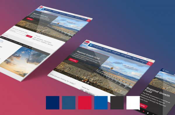
Accessible Website Example 2 – NSW Government
The NSW.gov website is the top level NSW government website for communicating their services, plans, initiatives for 7.5 million NSW residents.
In a joint effort by Internetrix, Silverstripe Australia and Webling, the NSW.gov website was designed and developed to ensure content is available to the widest possible audience, including readers using assistive technology.
Visually, the website presents information clearly and is accompanied by large images and unique layouts. The colours used are bold and vibrant and pass accessibility contrast level requirements and all functionality is accessible with a keyboard.
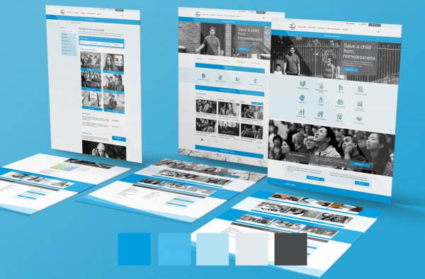
Accessible Website Example 3 – Wesley Mission
https://www.wesleymission.org.au
“Many organisations claim to put people first. But how often are these words supported by real action? For Wesley Mission, helping people is what inspires us every day.” Wesley Mission and their team of dedicated staff and volunteers help a wide range of Australians.
Internetrix previously worked with Wesley Mission to build their gift shop and were delighted to be given the opportunity to work on the website redesign in 2017.
Easy to use, keyboard accessible, mega menu and interactive elements, clear links, well structured code, links to pass repeating blocks of text and alternate image text, all work to help a variety of users access the site’s content.
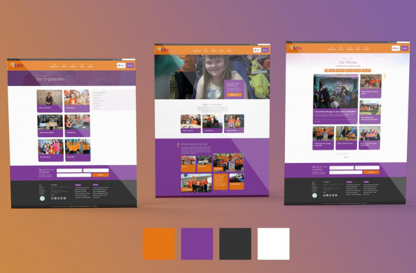
Accessible Website Example 4 – KidzWish
http://www.kidzwishfoundation.org.au/
KidzWish started in 2004 to bring support, love and laughter to children in our community who are sick, disadvantaged or have a disability. Last year, Internetrix created a complete rebuild of the KidzWish website. Their brand is fun and joyous, with lots of colour and great mix of images. As the KidzWish website is accessed by a variety of people with different abilities who consume content in many ways, it was crucial the new website worked well visually, had a strong back end to capture and process donations, and was built in a way that as many people as possible could access content.
Accessible Website Example 5 – The Cram Foundation
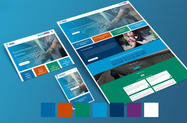
The Cram Foundation has a long history since 1932, providing disability care, housing, disability transport and recreational activities. Cram approached Internetrix to complete a website redesign that was fresh, better branded, and that followed accessibility guidelines.
By altering the existing brand colours slightly, we managed to provide a bright, colourful website, exciting, lively and modern interface that still passes website accessibility colour contrast levels.
There is no need to choose aesthetics over website accessibility because they can work together to deliver a complete solution, allowing your website to be enjoyed by all of your users.

