As we already wrote here and here, we are super excited about Google Looker Studio and the opportunity it provides to drive data reporting and visualisation standards to a whole new level of excellence.
Create your first Looker Studio dashboard
In this article, we are doing a deep dive into reporting where we spend time on the internal workings of Google Looker Studio and help you create your first studio report. Join us for a walk-through as we build a report together from scratch.
After opening up the home screen, you will see a bunch of templates and list of reports you can access. Open up a blank report and then a data source from the left sidebar.
For this tutorial, we click on ‘create a new Data Source’ and connect to one of our databases in Google Analytics. Different options to import data include Cloud SQL, BigQuery, Google Sheets, MySQL and more.
To open the data, follow these steps:
- Go to Looker Studio
- Start a new report (click on Blank Page)
- Create New Data Source
- Locate Google Analytics
- Connect to relevant view and click Connect and then Click on Add to Report
The data source has four main parts: field, field ID, field type and field aggregation that will be explained later. After importing data, go to the report editor page where you can see all of the visualisations in the toolbar. The property panel on the right is for modifying visualisations. Before building the report, we clarify the objectives and target audience of the report. Always keep in mind that the main goal is not making just a pretty report but aim instead for one that is really useful for our target audience. The content and information detail you add to the report is dependent on the audience you are targeting.
The world of data visualisation is simply too vast to summarise in a blog post, so we restrict ourselves to the most useful examples you’ll use in the majority of reports. In this tutorial we want a dashboard giving us insights into customer engagement for our target audience of people who run the business. This is the focus of the details we choose for the report.
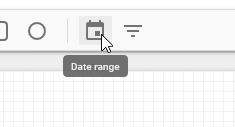
- find the Date Range, then drag it from the toolbar and drop it to the report editor page
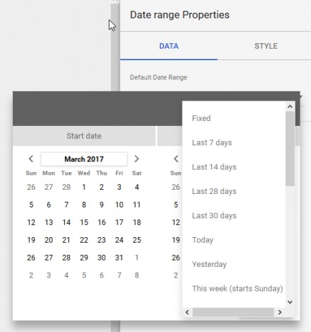
- Go to the panel property on the right, and in this case select ‘last 30 days’ as default value. Double check your data source!
- Now let’s look at the Scorecard, one of the most common and useful visualisations in Google data studio. Find Scorecard in the toolbar and drag and drop it into the report editor page.
- On the right, we then see the Scorecard properties which have two tabs: DATA and STYLE. In the DATA tab, change the metric from session to users.
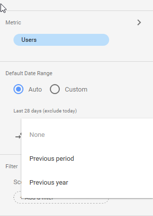
- Note that Scorecard allows us to compare metrics with a previous period or any other specified time period.
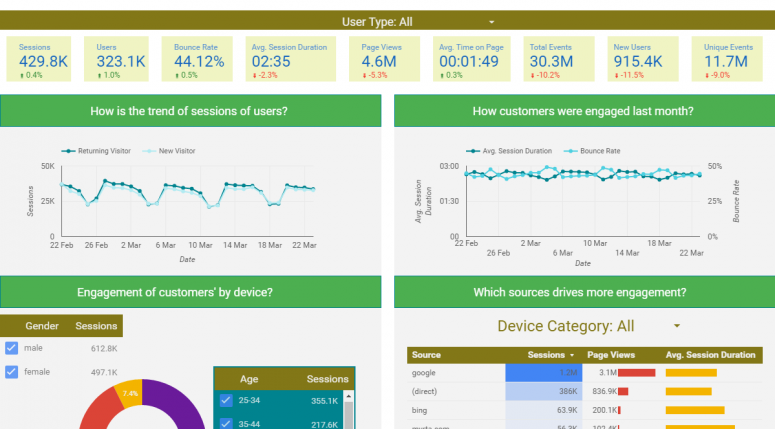
- Spend some time on Scoreboard and try to add metrics such as Sessions, Bounce Rate, Avg.Session Duration, Pageviews, Avg.Time on Page, Total Events and New Users. Try to create something like the following at the top of your report.
- Another popular visualisation used in almost every Data Studio dashboard, is Time Series. Drag and Drop Time Series
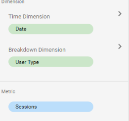
- Let’s dig deeper into a more complicated and useful time series chart. In Breakdown Dimension select User Type.
- Create another time series chart and select two metrics: Avg.Session Duration; and Bounce Rate.
- Go to Style tab of this time series and select the left axis for Avg.Session Duration and the rightaxis for Bounce Rate
- If you have done everything right, you will have two time series charts looking like this:
- Drag and drop a Pie chart and choose Device Category as dimension.
- Add a filter to the report.
- In the property control of the filter, go to the Data tab and select Gender as dimension.
- Let’s pause here for a moment, and switch from edit mode to view mode. This is the view that your viewers expect when you share with them.
- Notice that the dashboard is live and interactive. First, check the date range control you already created and try another specific data range. Now watch the magic, how all of your visualisations change to the time period you selected.
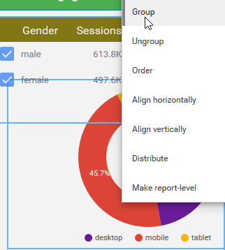
This is the beauty when you share the dashboard with your viewers that they are not stuck in a particular date range and can see the analysis for other periods. Let’s now work with the filter control and try choosing only males. You’ll see all the visualisations in the report are updated. - Now go back to edit mode. Here we restrict the scope of the filter control to only the pie chart. All you have to do is multi-select the pie chart and the control filter and right-click on them. Then group them together. If you now test the control group you can see that the filter is limited to only the pie chart: the other charts are not affected.
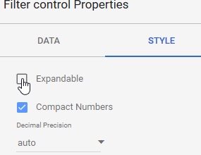
- Note there are two modes for filter controls. In filter control properties, when you choose Expandable, the filter control changes to drop-down mode.
- Tables are another important part of any data visualisation. Let’s look at tables by choosing to drag and drop a table from the toolbar, selecting source as dimension and selecting three metrics: Sessions, Page Views and Avg.Session Duration.
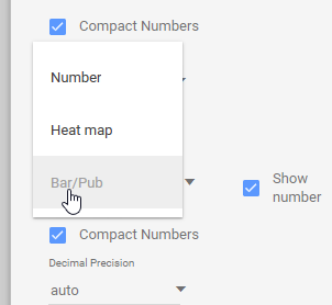
- In the style tab, change the first column (sessions) from number to heatmap; then change the second and third columns from number to bar/pub.
- We have a wide range of modification and visualisation options for tables. Explore the style tab and try to create something like this
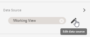
- Now you are familiar with the fundamentals of Looker Studio and can build dashboards, let’s go deeper for a more complicated look. Let’s assume that sign up is the most important event for your audience who want to see the number of sign ups compared with other events. In this case, you need to edit your data source and create a calculated field.
- Create a calculated field and select a name for your new column, for example, “Events Importance”. Then type in a formula that labels sign up events as “important” and the other events as “not important”. Whilst thinking about these steps, have a look at the function list here .
- Add the formula CASE WHEN Event Category =’Sign up’ THEN ‘Important’ ELSE ‘Not Important’ END. You might want to change ‘sin up’ to another event category that exists in your data set.
- Follow the instructions for Pie chart and draw a pie chart that compares the ‘important’ events with ‘not important’ events.
- We can try another exercise, namely, to compare the total events trending from Australia within the previous month. In this case, you need to add a filter in the property of the chart as shown in the following image. Also, don’t forget to to change the default Range to “Previous Period”.
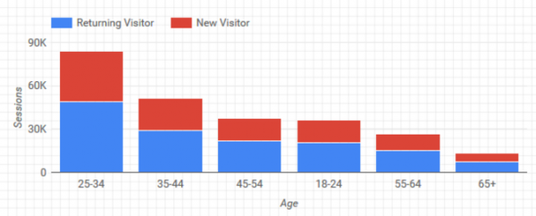
- For the last chart, try to create a bar chart that compares new users with returning users in different age groups. Create this bar chart in a new page of the report. It should look like this:
- Separating different points in Google Data Studio makes the report more engaging. In the toolbar, choose from a range of options, such as shapes, text and images to make your report look cool. Here we show an example, but it is over to you to tell different stories by using different approaches to divide charts.
- Once you are happy with the resulting report, you are ready to share it with your target audience and colleagues. Sharing is super simple in Data Studio because it uses the Google Drive sharing model. Check first to make sure that the right people have the right access to the right data.
Conclusion
Without data visualisation, the world of SEO is meaningless. The sheer depth and breadth of Looker Studio get us excited because it provides a unique opportunity for the Analytics community to report data in a useful and aesthetic way.
